OBJECTIVES
- Improve content hierarchy and navigational paths to bring more interactions and get more clicks.
- Reduce cognitive overload to enhance clarity and responsiveness, reducing the clutter and bounce rates.
- Optimize Wayfinding elements to improve user satisfaction with the process of finding and completing owner-related tasks.
- Easily replicable to all brands (Whirlpool, KitchenAid, Maytag, Amana, InsidePass)
OUTCOME
AB TEST
- 473% clicks in the About Us link. This page wasn’t visible in the header before, it was only visible in the footer.
- 64% clicks in the Deliver to button. The increase in this button was very significant because many users forgot to check the location, resulting in deals being misunderstood, stock availability according to region, frustration during checkout when they changed the address, and the item wasn’t available anymore.
- -15% clicks in the Search bar. The users are finding what they need in the navigation, so it’s not necessary anymore to appeal to the search bar.
- 20% clicks in the Chat and -12% clicks in the Email link. The email contact will be discontinued, so it was very important to direct the user to ask for help in the chat.
- There was a switch of clicks between the Category Landing Page and Product Listings Page. While CLP decreased, the PLP increased.
INTERVIEWS| Total tasks: 8
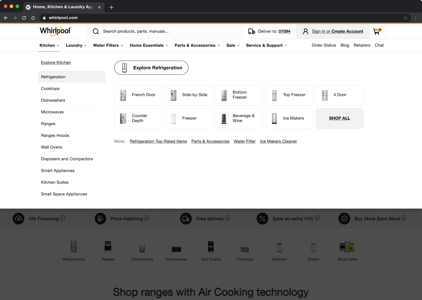
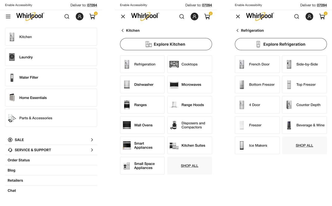
- Task: Purchasing a french door refrigerator
- Participants across both devices navigated to the French Door refrigerators with ease.
This confirms that one of Whirlpool’s most important categories, refrigeration, is easily accessible and intuitively placed within the site structure. - Success Rate: 100%
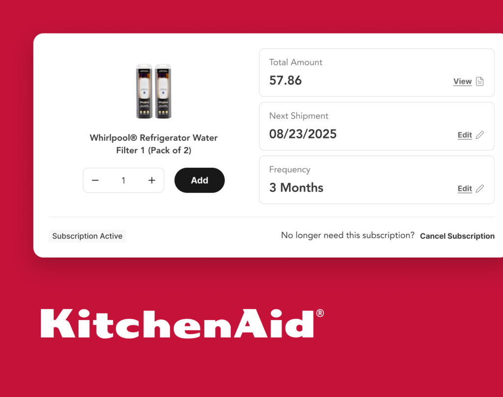
- Task: Subscribing to the water filter program
- Participants across both devices were able find the water filter subscription program without any difficulty.
This suggests that presenting the water filter as a distinct L0 menu item, separate from refrigeration, aligns with user expectations and feels intuitive to navigate.
- Success Rate: 100%
- Task: Exploring financing options
- When exploring financing options, 60% of participants navigated through Services & Support, while 33% found the correct path via Sales.
Only one person was unable to locate financing information.
- Success Rate: 93%
USERS FEEDBACK
- “It was seamless. It was extremely easy. The navigation structure and layout is beautiful. I love the images. I thought that it was very easy to find everything that I was asked to look for and I didn’t have to scramble around to try to find it.”
- “Oh yes, I’ll look at top rated products because they’re not necessarily the most expensive. And I look at the stars and I, I usually only buy those. I’m not going to buy anything with a low rating. So I would only buy high rated stuff anyway.”
PROCESS
- Objective definition.
- Competitor and retailer benchmarking.
- Opportunity and solution tree.
- Heatmap and Google Analytics data evaluation.
- Check Baymard recommendations.
- Design exploration to define structure.
- Wireframe.
- Mid-fi designs.
- Mobile version.
- Prototype (Desktop and Mobile).
- Tests:
- Scenarios and scope definition.
- Card Sorting.
- A/B Tests.
- User Interviews.
- WCAG Adjustments.
- UX Writing.
- Final Design.
- Handoff.
BEFORE
For more information and to see the complete Figma working file, contact me.